Joining the club
After the announcement of a new soccer club joining the MLS, multiple designers have "hit the field" and "joined the club" by "kicking around" a couple brand concepts for the new team. Great hustle but I'm not crazy about either of the designs.
Hyperkat, a small Brooklyn design agency, drew inspiration from all the Soccer and New York cliches. The font is a bit stiff and the color palette is unoriginal by just using Manchester City and NY Yankees colors (even if those are the owners of the club).
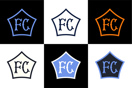
Mark Willis' concept isn't much different although he does recognize that Attitude should be considered. The color palette is the same and the pentagon shape that represents the 5 boroughs is used again. Also, the FC letters feel more like old school baseball stitching than they do for a futbol club.


