NYCFC
The votes are in.
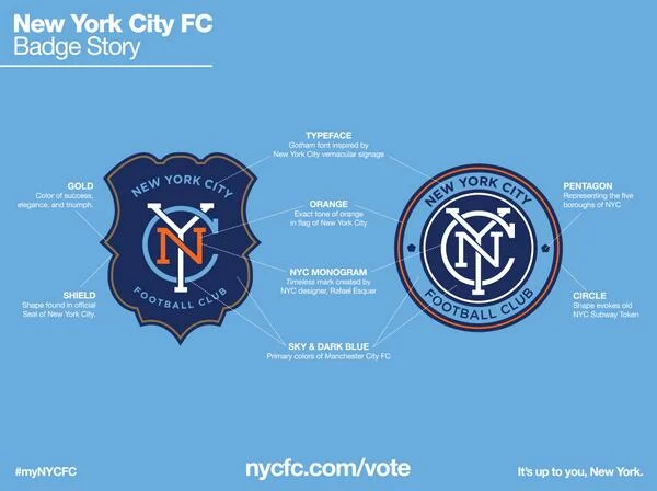
The New York City Football Club unveiled it's official team badge after letting fans vote on one of two designs for 4 days. The selected badge was created by Rafael Esquer and was inspired by the old New York City Subway Token. It also contains a pentagon shape which 5 sides symbolize the 5 boroughs of New York City.
When the team was announced, I posted about some experimental designs here and here that aren't very far off from this final design. The colors, symbols and even type lock up are all quite similar.
In the end, I don't find the final design to be ground breaking (Gotham?) but I do think it's nice compared to some of the other logos in the MLS league. The biggest surprise to me was the decision to allow fans to vote on the design. Even though they weren't that far off from one another, I dig how marketing rolled it out in pieces.


