#OwnTheFuture
The Milwaukee Bucks have always been a team that has had trouble finding it's identity. They have always had a cool name (Bucks!) but they've never done a good job of nailing down a color palette that makes sense (Green & Purple!?). Fortunately, that's about to change.
In addition to going from last place to making the Eastern Conference playoffs, fans will have something else to cheer this season. They are finally getting a proper rebranding.
1968/69 - 1992/93
1993/94 - 2005/06
2006/07 - 2014/15
Once the new branding was announced, I was excited to hear that the Brooklyn-based agency, Doubleday & Cartwright, was behind it. D&C has done a ton of great work for Nike and are very dialed into the sports world so I was confident that they would get it right.
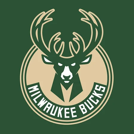
Primary Logo
Secondary Logo
I have to be honest. At first, I didn't get the secondary logo of the M in the ball. It seemed out of place. Then, I realized that the shape of the buck's neck was the same exact M. Like the antlers that form an abstract ball, it's a nice subtle detail that helps tie it all together.
The only part I'm not a fan of is the tertiary logo that's the shape of Wisconsin. I feel like the rigid edges of the state clash with the contoured lines of the basketball. The extra blue outline seems to be unnecessary too.
Tertiary Logo
“Recently under new ownership, the Milwaukee Bucks are poised to do for Wisconsin basketball what the Nets have done for Brooklyn: reignite excitement for the game at the local and statewide levels. ”
Custom typeface, MKE Block Varsity, inspired by traditional varsity lettering.
Overall, I think this is a huge upgrade for a small market team. All the elements of the branding, colors, logos and type, help modernize the brand but still keep it true to it's roosts. I'm excited to see the next step of the branding in context on the new uniforms, which are planned to be unveiled this summer.


